The company’s official website is a window directly facing users, which can play a great role in users’ impressions and is an important display platform for the company. A good website can naturally give users a good impression and even help the company add value.
Many traditional industries are currently undergoing transformation and are beginning to seek new development opportunities online and improve their competitiveness through website revision and upgrade.
This article will share several website cases of famous steel companies at home and abroad from the perspective of web design in the industry. From the case, you will find that even in the same industry, there are big differences in the design of domestic and foreign websites. I hope that these sharings can bring some inspiration to the designers.
When it comes to company websites in the steel industry, some people’s minds may instantly appear in the common styles of traditional websites. The main feature is the high degree of similarity between the websites, which makes people feel that they are made using the same template, which looks outdated and conservative.
Is this really the case? Let’s first look at the case of foreign steel industry websites.
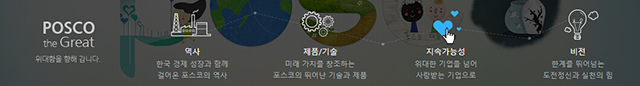
1. Posco
The official website of South Korea’s Pohang Steel Corporation is a responsive website. The homepage of the website displays content in a full-screen scrolling manner.

Some sections of the homepage have added some interactive effects, such as the icon below is filled with blue when the mouse is hovered.
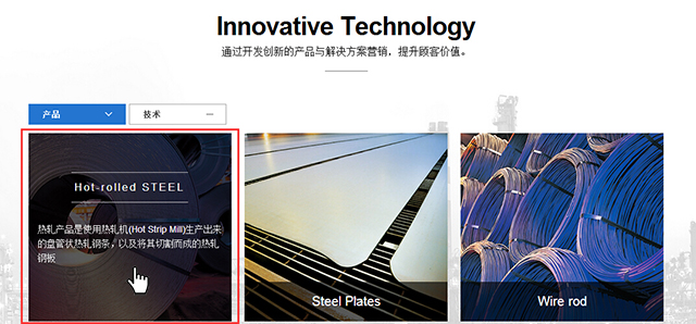
The text message appears on the picture when hovering the mouse in the picture below:
There are many types of layouts on the entire website page, which appear to be very rich when there are many levels.
And the website is very well handled in detail. For example, PC navigation has two entrances, one is classified according to the column, which belongs to the normal level navigation, and the other is the hamburger icon. After clicking, you can get the full details page entrance display, and you can quickly find what you want. Information, giving users a better experience.

The effect of clicking the hamburger icon:

The overall style of the website is relatively uniform, and the use of linear vector diagrams and icons is another highlight of the website.
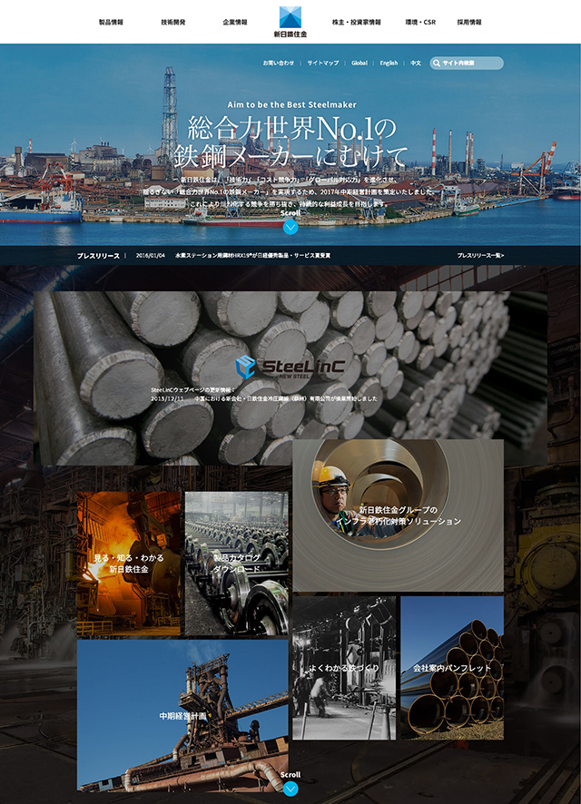
2. Nssmc
Nippon Steel & Sumikin is the world’s second largest company in steel production. The banner of this website is matched with large text, which has a visual impact.
The company logo in the navigation is located in the middle of the navigation, just distinguishing 6 navigation columns, and the graphics in the logo itself is symmetrical, and this navigation style has a visually balanced beauty.
Slide the mouse on the homepage, the content scrolls up slowly, and the upper and lower background pictures have a sense of interlacing, which has a good visual effect.
However, the design of the content page of the website is relatively conservative. The design of the inner page is more traditional, and the style of the homepage is very different. This will cause users to have doubts during browsing and even think that they belong to a different website. The content page design as shown in the figure below:
It can be seen from this website that the consistency of the design styles of the homepage and inner pages of a website is an important issue that designers need to consider and pay attention to.
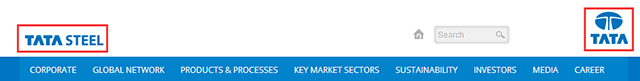
3. Tata Steel
Tata Steel is a subsidiary of India’s Tata Group. The website uses a blue color, and the overall style is flat.
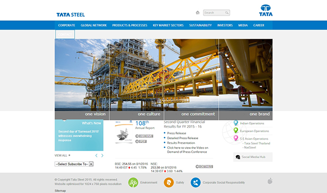
There is a bright spot in the navigation design of the website. The drop-down design when the mouse is hovering adopts a mixed form of graphics and text, which is visually clear and can better attract users.
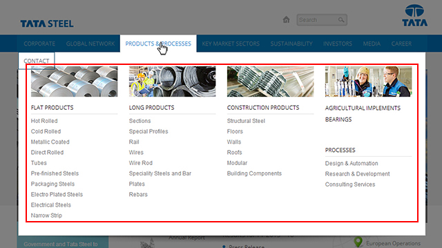
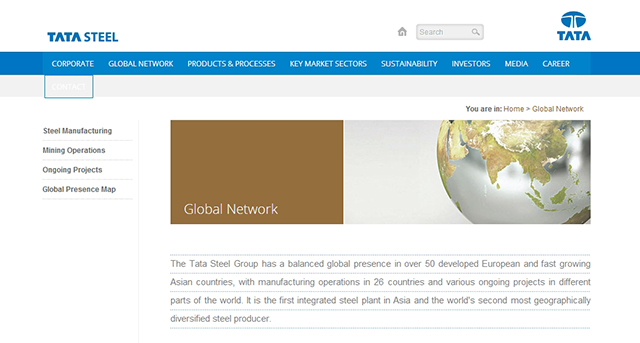
The shortcomings are also obvious: Although the homepage looks concise at first glance, the content format is relatively simple. For example, in the figure below, the left and right layout of the content page, the left navigation and the right form make people feel very monotonous, and the overall interaction of the website is small, and the content and styles are not rich, so it appears empty.
The group logo in the upper right corner clicks to jump to another website, which is easy to confuse with the logo setting in the upper left corner to quickly return to the homepage.
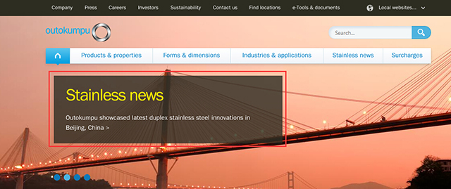
4. Outokumpu
The homepage design of Outokumpu’s website is visually magnificent. The banner column, combined with the secondary navigation, shows a certain level.
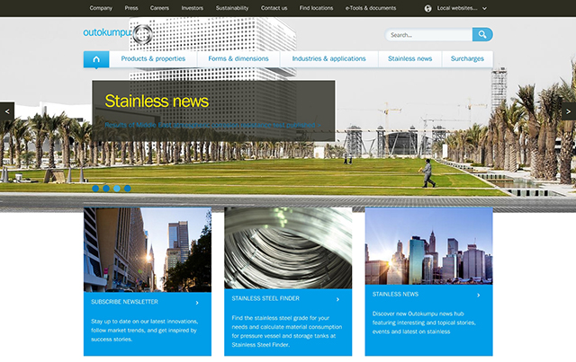
The design style of each page of the website is unified, and the layout of the combination of graphics and text is relatively consistent, so that the whole website maintains a kind of integrity, and the browsing effect is relatively good.
The layout of a large number of pictures guarantees the visual effect, but there are also problems. For example, when the page is opened, multiple large background pictures can easily cause the problem of slow picture loading, which affects the user’s browsing experience. In addition, some of the color blocks in the banner picture are heavy in color and look like they are pasted on the picture, lacking a sense of integration.
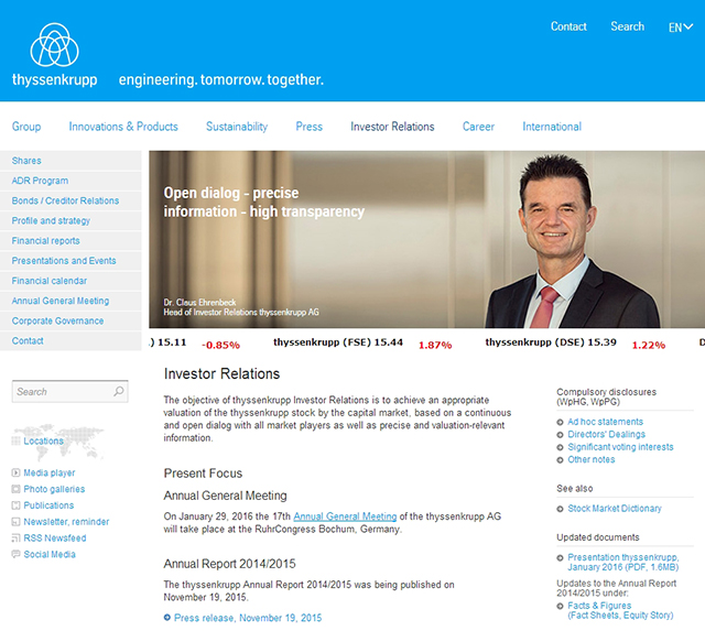
5. Thyssenkrupp
ThyssenKrupp’s official website is a typical flat style. The website design shows a distinct “sense of science and technology”. Time catches people’s attention.
The blue color block in the following section serves as a picture and can better convey text information.
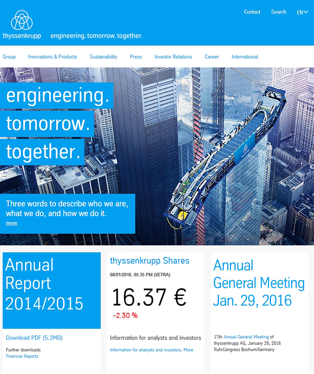
The design of the website content page is a conventional layout, which is slightly monotonous. The entire website is excessively flat, lacks features, and has almost no interactive effects, making the entire website lacking vitality. The inner page design as shown below:
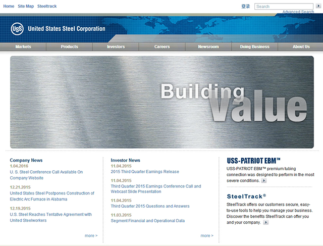
6. USS
Compared with the previous websites, the U.S. Steel Company website appears to be the most traditional.
The gray on the homepage is very dull, and there are relatively few pictures on each page, which is unattractive.
The entire website looks like a few years ago, with a single content, which does not conform to the mainstream trend of the current website.
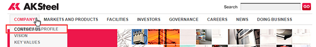
7. AK Steel
Many steel companies’ websites use blue as the main color, but AK Steel’s website looks unique. The AK steel company website uses rose red because its logo is rose red.
The main color of the website is consistent with the logo color, which is lively. The small picture combination design on the homepage shows a small creativity.
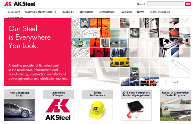
There is a single column in the website navigation, which conflicts with the color block behind it, which is abrupt and visually unsightly.
And when the mouse is hovering, the text overlaps in the drop-down, which affects the browsing effect.
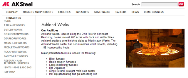
The overall design of the website still belongs to the traditional style. In addition to the crowded layout of a large number of texts on the details page and the lack of picture matching, there are still some problems in the handling of many details, resulting in a poor overall visual experience. The picture and text in the following figure lack integration, and the overall content is monotonous:
A typical feature of domestic steel industry websites is that they are approaching in overall style, using pseudo-material design styles, mostly gray backgrounds, and a large number of highlights, gradients or shadows.
This design style website belongs to the traditional style, which may have certain advantages in reducing the cost of cognitive learning, but a large number of pseudo-materialized designs can easily cause aesthetic fatigue and make the website look dull.
But we can also learn some of the small highlights.
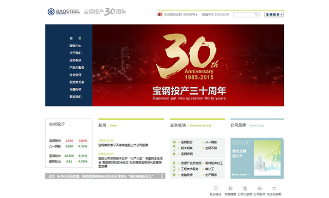
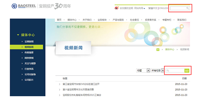
8. BaoSteel
The navigation background color of the official website of Baosteel Group Co., Ltd. adopts the same blue color as the logo. Except for the red of the banner, the overall color matching of the inner page looks more comfortable.
Color matching of inner page:

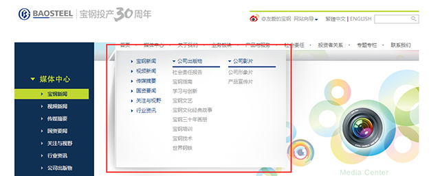
The drop-down design of the horizontal navigation is a typical materialized style. Although this part of the content appears to highlight the image, it conflicts with the flat style of the side navigation and is visually complicated.
There are still some areas that need to be optimized in the details of the website, such as the uneven style. As shown in the figure below, the same is a search box. The search icon on the top adopts a quasi-material design, and the search icon below adopts a flat design.
9. WISCO
Compared with the case of American AK Steel Corporation (rose red), the official website of Wuhan Iron and Steel Group Corporation also applies the red of the company’s own logo.
However, the official website of WISCO is different from the website of AK Steel Company in the United States. The red of WISCO Logo is used as a secondary color on the website, rather than the main color.
The WISCO website uses gray as the main color, which looks rather dull as a whole.
The design of the website also adopted a pseudo-materialized style, such as the background, navigation, and gradient and highlight effects of each column.

Judging from the layout and pictures, the website as a whole looks quite normal, staid, and inflexible.

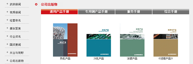
The website displays company publications, which is one of the features. If you can do some optimization on the interaction, you can add color to the website.
10. ShouGang Group
The Shougang Group website adopts blue color and the overall collocation of pictures and text has a fresh feeling, but the website still belongs to the traditional style.
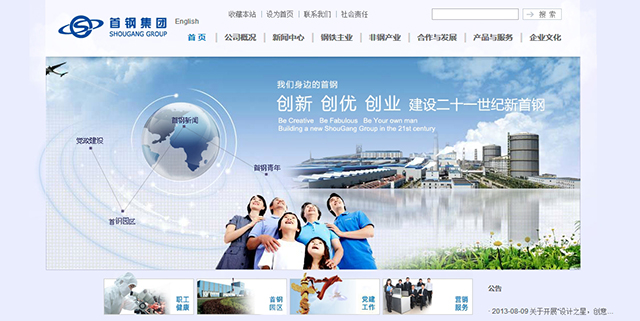
The website’s details page has some unreasonable layouts, such as unclear pictures, small texts that are not clear, crowded text layouts, and poor overall browsing and user experience.

11. HBIS
There are many branches under HBIS. The traditional style of this website looks like the style of the website 10 years ago, with no highlights in content and layout.
Hegang has been ranked high in the world steel industry in the past two years, but the website only displays the basic situation of the company and does not have its own characteristics. Compared with the strength of being a large enterprise, the website appears outdated and backward.

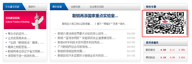
12. AnSteel
Compared with the previous domestic cases, the official website of Ansteel Group has been greatly improved. Although the website still adopts a pseudo-material design style, such as navigation and column names, the details are more natural.
Moreover, the color matching of the website is reasonable, and the color matching and graphic layout of the whole site look relatively uniform. The following figure shows a better overall visual effect of the website.

Website internal pages:

The website also has some problems, such as the stretching and deformation of the QR code and the unclear image deformation, which will affect the user experience.
The above is the case shared this time. Later, we will supplement and analyze the case based on the actual situation.
Judging from the cases collected so far, we can preliminarily summarize some common characteristics of steel industry websites: most of the steel industry websites are mainly blue (or gray, Logo);
Website design styles are roughly divided into two types, one is traditional style; the other is in line with the web design trends in recent years, and is relatively focused on visual and interactive effects.
On the whole, the design of domestic steel company websites tends to be more traditional and looks outdated. However, some companies have begun to pay attention to corporate transformation and website revision. Although foreign steel company websites also have some traditional websites, they generally pay more attention to them. Visual effects and company image display, and the entire industry pays attention to the company website earlier than in China.
After understanding this information, designers can refer to industry cases for customers in the steel industry, and according to the customer’s company strategy and business needs, targeted in-depth research, designing a website that meets customer needs is easier.