The article mainly analyzes how different visual design elements affect the user experience of the website, and hope that the interpretation of the article can bring some inspiration to your product design.
Maybe it’s because I don’t have much experience in visual design. I find that when discussing design plans with visual designers, we often discuss: “I think this layout is very strange”, “I think A is not very good-looking”, “This place gives me a certain XXX feeling”, “Will this display bring some misunderstanding to users”…
It is not difficult to find that most of the time we are discussing an unpredictable “feeling” . Visual design certainly requires aesthetics and creativity derived from intuition, but as a “design” field, it requires more rational thinking . Why should this be? How does this affect users’ emotions and behaviors? We need some research results and empirical rules as a reference, and we can make a good design if we know why.
The following is the original text:
introduce
Designing a beautiful user interface for a website, app, or product requires a special combination of skills, talent, and inspiration.
But the design of the user interface is not pretty. It should help users do what they need to do.
In order to create a design that is not only attractive, but also serves the user experience, you need to clearly recognize how your design decisions help or hinder your users.
We have performed and analyzed hundreds of thousands of usability studies in UserTesting, and have seen many effective (and not so effective) visual design decisions from them. Now we want to share what we learned from these studies.
This article is about how different visual design elements affect the user experience in a website, APP or product. We will talk about the following:
- colour
- typesetting
- icon
- Test your design with users
You will learn how to make user-friendly design decisions and bring the best results for your company.
colour
In the designer’s toolbox, color is one of the most powerful tools.
You can use colors to influence the emotions of users, attract their attention, and put them in an emotional experience suitable for shopping. Color is also one of the main factors of customers’ perception of a brand.
Since the possible color combinations are unlimited, it is difficult to decide which color will have the greatest impact on your website or application. It is impossible to test all colors, but we have summarized some tips and trends on how colors affect users’ attitudes and behaviors.
Color theory and user experience
The principle of basic color theory is an important starting point for sculpting user experience.
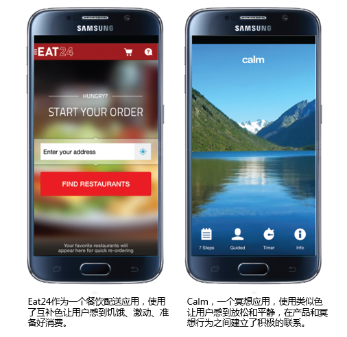
Complementary colors can be used to attract the viewer’s attention and create vitality, while similar colors can be used to create a sense of coordination and consistency in the design. Think about how you can use complementary or similar color schemes on the homepage or home screen to set the tone for users and get them into a mentality that will prompt them to take the behavior you expect.
When you use color in text, remember that putting two low-contrast colors together will make them very difficult to read (regardless of whether they are complementary colors or similar colors).
This is especially true on mobile phone screens, because users are more likely to use the mobile phone outdoors or in bright places, making the screen dazzling.
(Annotation: The original text describes a study they did on gender differences in color preference, but since the sample is only 50 people and the difference is not big, it is not translated here, and interested students can view the original text.)
The associations brought by colors are different for different individuals in different cultures. Different genders often have different color preferences, and annual fashion colors may be more attractive to young people or high-income groups.
Color Psychology and Relevance
As we all know, colors can evoke emotions. The following are the emotions traditionally associated with colors:
- Red: strength, passion, appetite, love, danger
- Orange: confident, happy, friendly
- Yellow: youth, happiness, warmth, sunshine
- Green: growth, money, healing, environment, jealousy
- Blue: trust, peace, loyalty, masculinity, security
- Purple: royalty, mystery, spirituality, creation
- Brown: outdoor, food, conservative, earth
- Black: formal, luxurious, elegant, death
- White: Spring Festival, simple, kind, fresh
Trademark and Industry
Many well-known companies use color to evoke certain emotions long before customers buy.

Customers will also associate colors with specific industries, such as blue and technology, green and health, red and fast food. When some companies choose to use industry-specific colors in order to match customer expectations, some companies find that doing the opposite can quickly make an impression.
Give a chestnut. In the travel industry, blue is very common for websites and applications. Take a look at the homepage of this website:
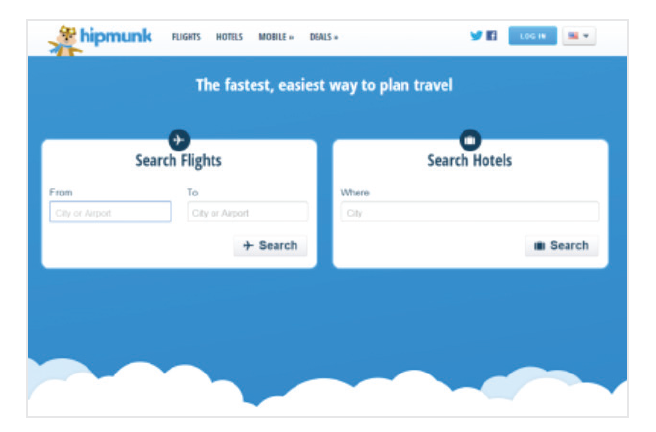
Blue represents trustworthiness, which is a good thing for travel companies. But the use of blue on travel websites is not an ironclad rule.
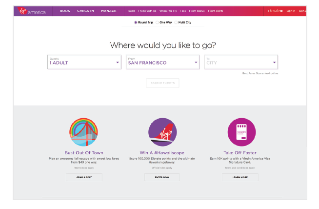
Virgin America chose the opposite when designing its website.
When it is different from what users expect from aviation websites, it will be more prominent. Choosing an unexpected color can effectively make the user experience happy and make them remember your company.
- Consider how traditional your target customer is.
- How did they react to deviations from the norm?
- Does this make them happy or confused?
- If your color scheme deviates from traditional expectations, what message does your company convey?
Color and accessibility
What does your website or app look like to users with visual impairments?
Approximately 8% of men and 0.5% of women suffer from some form of color blindness. There are many cases of color blindness, but red-green color blindness is the most common. People with red-green color blindness cannot distinguish between red, green, and yellow with similar values, especially when green contains more yellow than blue, such as the olive background color below.

The same button, the left side is seen by people with normal vision, and the right side is seen by people with red-green color blindness
If you are using low-contrast colors, be aware that color-blind users may not be able to read text or pictures at all. This problem is particularly serious during the winter vacation, and a large number of websites are flooded with festive red and green. Remember, if 8% of male visitors cannot see the text “Buy Now” on the button, then you may be losing a considerable number of conversions.
If you have to use color combinations that are indistinguishable for people with color blindness, you can still ensure accessibility by increasing the contrast between colors. For example, the picture below uses very dark red and very bright green, which is easy to see whether it is color blind or not.

The same button, the left side is seen by people with normal vision, and the right side is seen by people with red-green color blindness
There are also some important points about accessibility: Don’t forget those users who might be using a screen reader to visit your website. Have you ever received an error message when filling in a form, such as “Fields marked in red are required”? This is an extremely bad experience for those who cannot see the red characters. It’s best to avoid mentioning colors in websites or apps, and provide more specific error messages, such as “email address is required.”
Accessibility testing tool
There are some great tools to help you test the accessibility of your website.
- Download Color Oracle ‘s color blindness simulator, available in Windows, Mac and Linux versions;
- Upload your static pictures to Coblis , you can experience them with nine different color perspectives;
- People with color blindness can even be invited to test the website to see if there are things they can’t see clearly.
The effect of color on conversion rate
Some experts who optimize conversion rates will claim that the best color for a button is bold, eye-catching red, but others say that green is the best because green means “start.”
A large number of A/B tests have shown that the color change of the CTA button (CallToAction) has a great impact on the conversion. HubSpot shared this famous test when it was still called Performable:
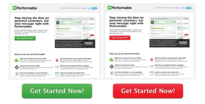
HubSpot’s A/B test
Although they originally predicted that the green button would perform better, the red button brought 21% more clicks. But they still remind readers that the test result itself should not make everyone turn the button red. A possible explanation is that their users just like red, although other users may prefer green. Or, it is more likely that the red button gets more attention because it is the only red object on this page.
The bad news is that there is no magic color that performs best on all websites. The good news is that there are some rules of thumb that can help you use color effectively.
Rule of thumb
Contrast is the key
This seems obvious, but we still have to say: if you want users to click somewhere, you have to make it prominent enough. If your website or application uses a lot of orange, users may not notice an orange button right away, no matter how well the orange button performs in other companies’ A/B tests.
In our research, we asked users to point out the first thing they would click on on each website. Not surprisingly, users are more likely to click on the CTA button that contrasts strongly with the background.
Bright and unforgettable
In the 50-person study mentioned above, the last question we asked was which website the user visited was the most impressive.
50% of users choose bright websites. What’s interesting is that many users who choose dark or white websites do so for reasons that have nothing to do with design. For example, a user thinks that Dropbox is the most impressive because she already has a Dropbox account.
Font
The main purpose of text is to help users do what you need them to do-whether it’s exploring the product, learning how to play a game, or browsing some pleasant stories.
Unfortunately, there are many conflicting options in website and application layout, and there is no strict rule that applies to all situations (otherwise things would be too simple). But there are some things you can do to ensure that the font you choose for your website or app is helpful to you and your users, rather than going against you.
Font size and line length
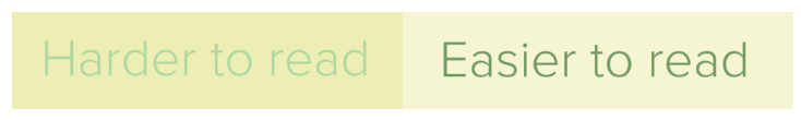
The size and layout of the text will have a huge impact on the online reading experience. Older people or people with visual impairments are especially distressed when facing small print. Even people with normal vision can feel tired after staring at the screen for too long-they get irritated when they have to squint or zoom in to read.
Take a look at the following example: For desktop computers, a better way to process the text is 50-75 characters per line, and the font size is not less than 16pt.
Compare this page with 100 characters per line and a smaller font.
This problem extends to some extent on mobile phones. It is a headache for users to read on a small bright screen. A better practice is to display 30-40 characters per line on the phone . Below are two websites I saw on a smartphone. The first used 30-40 characters, while the second used the size of a website designed for desktop computers.
Because hard-coded font sizes (for example, 16px) display different effects on different devices, try to use rem units to define font sizes. Facilitate the realization of responsive design).
Text color contrast
Regarding text color and readability, there are two different opinions:
- One thinks that high contrast is better, and black text on a white background is the most readable combination;
- The other thinks that too much contrast is difficult to read, and it is better to use shades of gray.
How much contrast is applied requires a delicate balance. Because the differences between the screens are so great, the gray that appears dark enough on the designer’s screen may be lighter on the user’s screen.
It is especially important to have sufficient contrast on a mobile phone, because the user may need to use it outdoors or in a bright place.
The W3C website content accessibility guidelines are a good start. They set a minimum contrast standard to ensure that users with moderately low vision can read your text. You can use a contrast ratio tool to quickly find out whether the contrast you set is in the right range.
But pure black text (#000000) is more difficult for people with dyslexia to read, and can cause eye fatigue after long reading.
Many designers choose to use very dark gray or actual black (rather than pure black), such as #0D0D0D, #0F0F0F, or #141414.
Once you choose the color, it is absolutely necessary for real users to try out any device you can think of in a natural environment. If any test user is having trouble reading your text, then there is reason to believe that your customer is experiencing the same problem.
Our research results: serifs and sans serifs
There is a common sense in traditional typography that serif fonts can improve readability and reading speed by gently guiding the line of sight in the horizontal direction.
But the results of research on the actual differences between these two fonts are very uncertain. We need to do experiments on our own, so we did a study to let 30 users read two pages that were identical except for the font (A uses Arial, B uses Times New Roman), and measured the reading time and comprehension degree.
The results we got are also difficult to conclude.
The average reading speed of users who read pages with sans-serif fonts was 9% higher, but the difference did not reach a statistically significant level. Moreover, the understanding rate of users is very close: the understanding score of users who read serif font pages is 1% higher, which is also insignificant.
The only noticeable difference is that users who read serif fonts complained twice as many times as the other group.
So what’s wrong with serif fonts?
First, the serifs change the outline of each letter, so they are more difficult to recognize for people with dyslexia or visual impairment.
Second, because these horizontal lines are very small, they display poorly on low-resolution old computer screens. (The Retina screens on smartphones and tablets have higher resolutions, which will make serif fonts easier to read.)
Does this mean that we should only use sans-serif fonts on electronic products?
Absolutely not. This just means that when you choose to use serif fonts, make sure to use clean and accurate online fonts, and—you know—test your choices with real users.
Choose the font that suits the user
The font you choose is a major part of the overall user experience on your website or app. Consider the complete situation instead of just relying on certain rules when designing.
What do your users expect?
Is there something more complicated? pleasure? Minimalism? Before visiting the website or opening your app, what do users already know about your brand? What kind of first impression do you want to create?
What equipment is the customer using?
For most electronic devices, your users will read your texts on the train, in front of the TV, on the sunny terrace. Make sure to keep their attention and don’t drive them away with hard-to-read text.
What is the user trying to accomplish?
Shopping? Learn? entertainment? Make sure that the experience you provide matches the needs of your users (and your business goals).
If you want your customers to quickly understand the features of your product so that they can decide to place an order, then choose a font that they can understand at a glance. If you want to keep the reader’s attention with a long and compelling story, then choose a font that makes it easy for users to keep their eyes on the page.
icon
Regardless of whether the design is a website or an application, any icon on the user interface should serve a certain purpose. Of course, the existence of icons is to save screen space. But more importantly, the icon should help your users. If handled correctly, icons can help you guide users to complete tasks quickly and intuitively without relying too much on text. But if not handled properly, icons can confuse users, lead them to the wrong path, and destroy their experience of using the product.
Because many applications and websites are using confusing icons, we want to know a question: What do we need to make an icon user-friendly?
We did a remote usability study to explore the user experience brought by icons on mobile applications. We observed 35 users interacting with 190 icons on a series of Android apps. Some icons are very obvious, such as a magnifying glass to indicate a search function. Some are less obvious, such as a flag indicating group members. Some have text labels, and some do not.
Icon type and its impact on user experience
Comfortable icon
Some icons are almost universal. A house-shaped icon will take you to the homepage or home screen, and a shopping cart will let you buy things. This is a pretty safe guess.
In most cases, the icon is not a place to be creative. You can rely on other design elements to convey the brand message. The first job of your icon is to guide your users where they want to go. Using peculiar or overly clever icons to represent basic functions will destroy the user experience. Just keep it simple.
The role of the icon is to guide the user. Please keep it simple.
Confusing and contradictory icons
When you use common icons with contradictions or multiple meanings, trouble comes.

Imagine you see this icon under a picture in an application. What does it mean? What happens if you click on it? This icon is used to show that you like something, which is very clear.
But will it save this picture or item to the favorites list? Will it inform someone that you like it? Will it shape your preferences and add similar pictures or items to your information sources? Or is it just a general expression of support?
Just like this heart, there are many icons that we often see in a variety of situations, but their functions in different icons are slightly different. Consider the following common icons with multiple meanings:
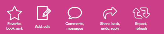
Even in the context of the application itself, these symbols can be very confusing. The user may expect a certain result but get a different result.
Not to mention the differences in iOS and Android conventions. The bar icons of different operating systems may be very different, which brings additional confusion to users. If you are not sure about this, please read this article describing 12 variations of sharing icons , several of which can easily be misunderstood as other things instead of sharing.
Obsolete icon
Many commonly used icons refer to outdated or obsolete technologies. The save icon reserved in many applications is no problem for most people who have used floppy disks, but many post-95s will think that these elderly people insist on using this icon is a quirk. Continuing to use icons like floppy disks will make your brand look outdated to younger users. Even the phone icon may need to evolve, because young users can no longer recognize the phone.
Unique icon
One of the toughest icon challenges is what to do when your product has unique features that are not included in the standard actions of sharing, liking, uploading pictures, and entering text. How do you use a simple symbol to convey a more abstract concept-such as watching your upcoming trip, sending an audiobook to a friend, checking your historical orders, or tracking your sleep patterns?
Many designers are trying, and many designers have failed. No matter what meaning an icon has after you know what an icon should represent, it may bring a completely different experience to users who use it for the first time.
This is not to say that if you want to create a usable user interface, you can’t stay away from universal icons. There are some unique icons that can effectively convey their meaning for both new and old users.
Twitter’s famous feather pipe pen icon is a good example. Although there is no label, 80% of users in our research correctly guessed what it does.
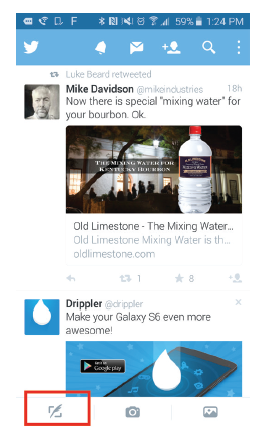
Let’s see what Twitter did on this icon:
- layout. Twitter separates the icons used for creation (writing tweets, taking pictures, and uploading pictures) and exploring (sources, notifications, information, people, and searches). If the user wants to write a post, there is a one-stop service area at the bottom of the screen.
- Text on the desktop version. Many people use Twitter on their computers in the first place. This way they will clearly see the explanatory text next to this icon.
- Memorability. Although the quill pen can be considered an outdated technology, just like a floppy disk, it is very unique and easy to remember. You won’t see feather tube pens in many applications, so users don’t have to try to distinguish the subtle differences in functionality from other products.
- Branding. The feather on the pen corresponds to the feather on the Twitter logo. This creates a sense of wholeness between the brand and the act of tweeting.
Labels and availability
For those who think that a picture is worth a thousand words, it may be a little disappointing:
The text label will greatly improve the usability of the icon.
It is easy to expect that users (especially mobile phone users) will go around and happily try all the different icons until they find out what each icon does.
But in reality, users will be frightened by the new user interface and will not explore outside their comfort zone as we would expect. In an unfamiliar product, the user wants to know clearly what will happen before taking action.
Your icon needs to set clear expectations for users before they click, and this usually means using text labels.
Our research results: with label VS without label
In our research, we found that for labeled icons, users can correctly predict what will happen before clicking them in 88% of the cases.
For icons without labels, this ratio is only 60%.
And if the icon without a label is unique in the app, then only 34% of users correctly predict what will happen before clicking.
For example, the Meetup app uses a name brand icon to represent group activities and adds some additional brand identity. However, because an empty name tag does not remind most people of events or announcements, they added tags. 100% of the test participants were able to correctly guess what this tagged icon could do.
Workaround
Some designers have found that tagging defeats the purpose of using icons and makes the user interface cluttered. In order to avoid the use of tags, they added instructions on the use of icons in the tutorial or guide page, hoping to train users how to interact with the icons.
Although this may be a good way to introduce unique or non-universal icons, it should not replace a more intuitive design. Remember one thing: users often skip tutorials or quickly forget everything they have learned. The tutorial should be a tool, not a reliance.
Test and verify design decisions
When making a new design, following best practices such as high-contrast buttons and readable fonts is a good start. But in the end, the correct design decision is the one that can bring the expected results. Find out if your design decisions give users intuition and influence them in the way you want.
Verify your hypothesis
Think of your design as a hypothesis that you often need to verify, disprove, or improve. This will give you the confidence to try a lot of experiments and discover what can bring the best business results and delight your users.
Do regular user testing to hear how users describe their experience when using your website, app, or product. You will hear them describe what emotion your brand is associated with, and you will see a lot of places where they are confused by confusing icons or difficult-to-read text.
But you don’t have to wait until you have a developed real product to collect user feedback; you can start user testing during the prototyping phase. This will help you validate your design decisions and continue with confidence, or quickly find and fix all designs that don’t work.
If your design has been implemented, use A/B testing to verify whether your design decisions have affected user behavior, conversion rates, and revenue in the way you expect.
Simple user test question
Here are some questions you can ask users when verifying your design:
- Before using [your website or application], please tell us what you expect from a company engaged in [your company’s business]. What do you think it can do? What do you think this website or application should look like?
- What will you click first?
- What three words would you use to describe this website or application?
- Use 1 point (very unpleasant) to 5 points (very pleasant) to rate how this website or app gives you?
- How likely are you to trust this company?
- How does this website or app compare to your expectations?
- Don’t click, tell us what do you think will happen if you click an icon of this shape? Then click on it, what actually happened?
If your design decisions work for users and can guide them to use your user interface, then users will be able to accomplish what you expect them to accomplish. This is not just an effective design-it is also an ingenious business practice.