Recently, my colleague’s grandfather passed away at the age of 80, and he gave me an Ipad. We all laughed at him for being too trendy, how could grandpa accept this high-tech thing. Unexpectedly, he said, “Grandpa just picks it up. It’s all right to play Angry Birds, Tom Cat, and listen to songs.”
This is really a very strange phenomenon: why ipad can be used by both the elderly and children, and the basic operations rarely require assistance and instructions from others!
Is it easy for children to accept electronic products? Or are electronic products easy for children to accept?
This not only makes me think about what kind of design can be “children and not deceived” so that both the elderly and children can use it smoothly. Then, the interaction design should not be “elite”, it should be “fool”, to pursue a more “instinctive” operation, as simple as eating and dressing.
How can design understanding become “user’s instinct”?
1. Understand your users
Think of users as simple, picky, slow, and busy: they can type less and type less, click less and click less, think less and think less.
The product is to be a good gentleman: to be considerate, warm, tolerant, secure, easy to understand and communicate. Sometimes, in order not to give users unnecessary interference, a lot of pressure and responsibilities have to be silently carried in the background.
2. Fully understand and guide the user’s behavior flow
On the one hand, it is necessary to understand the user’s possible click process, so that users can do whatever they want from each step to the next; on the other hand, the product must have a good information architecture, and the operation guidance must be highly logical, but it must be well understood.
For the completion of the entire operation, there needs to be a guide to let the user know where they are done and what they need.
In addition, it should be convenient for users to go back, back, repent, and return to the starting point.
3. Easy-to-understand expression
Easy-to-understand expressions include not only visuals and text, but also transparent interactive operations. The summary of quoting the smelly fish is:
- Before the operation, the result is predictable.
- During operation, the operation has feedback.
- After the operation, the operation can be undone.
Of course, some interactive operations mainly need to rely on the support of the outer layer of visual elements.
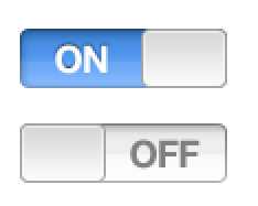
The biggest difference between a GUI designer and a general visual designer or graphic designer is that the design pattern must have some hints of interactive behavior. For example, the push button on the Ipad should give the user a hint of where to pull it. However, many PC products directly plagiarize it is not in line with the habit of using touch screen users to operate directly by hand. For more visual language metaphors, you can move to “Chatting Icon Information Communication”
Product description language should also be concise, easy to understand and friendly. Words are the power of understanding. When Apple launched the Macintosh, Jobs asked the user manual to be very easy to understand. His team said, “We tried our best. The manual only needs English at the third grade of high school.” Jobs said: “No, you can read it at the first grade of elementary school.” Culture is not necessarily a measure, but product language must not be used. It is literary, cryptic, or complicated and magnificent.
Sometimes, the more a user uses a simple product on the surface, it is only the tip of the iceberg, and more complex logic needs to be bred behind it. The seemingly simple and easy interaction also requires more careful thinking by the designer and repeated user testing.
In short, for “instinctive design”, we have to put in more effort and more thinking.