
Some websites are better than others in terms of content, usability, design, or functionality. The way to win lies in the details of interaction and animation. Here we share some cases with you through various models, and analyze why these simple methods can produce unforgettable effects.
We often use software like Photoshop and Sketch to design digital products. Most people who have worked in this industry for a few years should know that design is more than just visual communication. Nevertheless, there are still many people doing static design. For design, Jobs said this:
“Design is not about how it looks or how it feels. Designing is how the product works.”
Our experience and impression of products are influenced by comprehensive factors, among which interaction plays a fundamental role. We can no longer consider the user interface from a static perspective, and then add interactive effects. Instead, we need to think about interaction from the beginning, and treat this as a natural attribute of the interface.
Let’s take a look at some small and beautiful interaction examples and see how these clever motion effects gracefully improve the user experience.
Dynamic scrolling
Hyperlinks on web pages have both advantages and disadvantages. When you click on a link, you can’t predict what page you will be taken to. It may be a product page or a creepy old puppet storefront website. The connection between the front and the back is broken.
A great experience of reading books is that the content is linear. Each chapter in the book is progressive. For example, you must read the Introduction to Economics in Chapter 1 to help you understand Chapter 2. When you skip a chapter, you know that you may miss some information, which will result in a lack of understanding of the subsequent content. On web pages, especially on very long web pages, this phenomenon often happens unconsciously. At this time, you can solve this problem by adding a scrolling motion effect:
Compare this effect:

Comparing the default and dynamic methods of anchoring links, quickly sliding down to the content is no longer an unconscious action, it is a decision. In Hope Lies at 24 Frames Per Second there is a view on your phone menu button, when clicked, can return to the top of the page, but did not move any transition effect. It took me more than a minute to figure out what happened.
Remember: any sudden changes in the interface will make users feel difficult to make, don’t make them confused; clearly show what is going on.
State switching
As we have seen in the previous example, the process of switching can help users understand the path and direction of the interface. Nothing feels more unnatural than a sudden change, because transients do not exist in the real world. Let’s take a look at another example: switching menus. When users see the “+” symbol, they will think of adding content or expanding elements. After rotating 45°, the plus sign becomes a cross, this element is widely understood as “closed”:

This simple transition completely changed the meaning of the icon. Such a small detail means that there is no need to guess what will happen next, the user knows the meaning of the icon in the two states. If you ask me, I think such a switch is quite humane. In addition, please note that the rotation of the plus sign and the appearance of the content are in the same direction, which strengthens the direction of the information.
Remember: make sure your website elements are easy to understand in every state.
Shrink forms and comments
The comment form of many blogs and news sites is not a pleasant component to look at. why? Well, most of them are not friendly enough, right? When you are ready to post a comment, you just want to start typing the comment. However, a typical form requires you to provide various other information first, which is annoying.
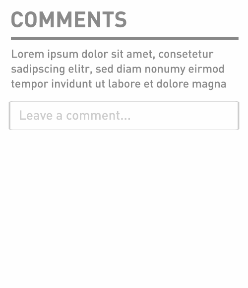
In order to motivate people to participate in comments, we can collapse the form and display only the most critical element: the comment box. When the user clicks on the comment box, you can expand the form accordingly. An example of this gradual disclosure method can be found on the beta website of the New York Times:
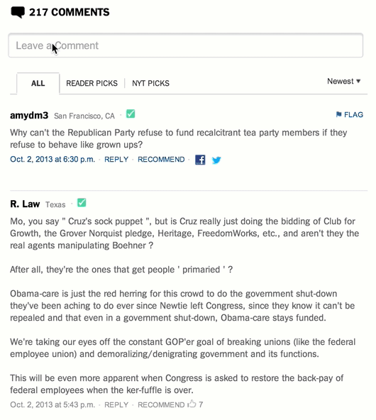
When the table expands, there is a better way to set the focus of the cursor on the comment box. But there will be a problem: an important principle of interaction design is that feedback actions should occur near the interaction (or on the trajectory of the focus). Let’s optimize it a bit and add transitional animation to the expansion of the comment box to help users locate:
You can even place the comment box at the top of the area, expand the size of the box accordingly and display other fields below the comment box.
As you can see, this reduces distractions and makes the comment form more noticeable. But what happens if you fold up all the comments?
By folding the comments, we can use the scroll bar to know the length of the text instead of the entire page. The usual practice is to automatically load the comments when the user reaches the bottom of the page. We should avoid forcing users to click unless there is a good reason.
Remember: The method of gradually disclosing information is to reduce the interference on the UI so as to highlight the functions that users need.
Pull down to refresh
One of the most exciting interactive operations that appeared shortly after the iPhone was launched was the “pull to refresh” (Developer: Loren Brichter). After the user pulls down, the content will be updated in reverse order according to the release time. You can see such an application in the Twitter app. Just pull down a little at the top of the tweet to refresh everything.
Why is this design so popular? Before pull-down refresh existed, users had to click the browser’s “refresh” button to load more content. The user’s desire for exploration is satisfied through the pull-down method, so that the need for clear operations is gradually eliminated.
Remember: When the operation meets the intent, the experience becomes more seamless.
Sticky label
Sticky tags are another subtle and useful user interface component, and also very interesting. Take a look at the introduction page of Edenspiekermann’s use of this technique
The item label will scroll with the content, thus providing a table of contents for the picture on the right, until the next item appears. This behavior is similar to the address book in iOS, and is especially helpful for indexing long content. This transition not only improves positioning but also makes context-based descriptions more fluid.
Remember: It is not suitable to use description or title to add valuable information in a long content view. At this time, consider using sticky tags.
Predictive transition
The concept of prophecy is derived from cognitive psychology, which means to guide the audience through the characteristics of a specific object.
In the context of user interface design, the following definitions are given in the EU website usability glossary:
“Predictiveness is an ideal attribute in the user interface (software), which can naturally guide people to take the correct steps to accomplish their goals.”
Bumps are often used to enhance predictions. The bump around the button implies that the button can be operated. This user experience technology is widely promoted in the iOS camera app.
The undulating texture around the camera icon in the iOS 6 lock screen suggests that the user can drag. In iOS7, this design was removed, making the icon look more like a separate button, because the user’s habits have been established. Obviously, what happens is still the same: when you drag the button, the lock screen pops up, revealing the bottom of the camera. This is a great technique to indicate to the user the functionality of the interface.
Remember: Improve the control in the interface to help users learn.
Hide index
The iOS version of Google Chrome has a hidden index design, like this:
The basic idea is that once the user drags down, the navigation controls of the Chrome browser are automatically hidden. As long as the user drags up again, the navigation reappears. This method not only improves the experience of browsing context (focusing on the content itself), but also increases screen space. Of course, the latter is particularly important on mobile devices.
One unquestionable statement is that users will always browse content that they are very interested in. Once they stop browsing, it is most likely to change the browsing content. Therefore, the navigation bar needs to appear at this time. Although this technology saves screen space, please confirm whether this kind of scene will appear in your product.
iOS goes a step further. When you reach the bottom of a page, the control bar will expand again. This is a good example of dynamically meeting user needs based on scenarios.
Remember: Use the hidden index method to let users focus more on the content and save screen space.