
Learning has always been a chore. How to work hard on design to make learning enjoyable? easy to say, hard to do. Intuitively speaking, people usually don’t go all out to learn new knowledge. The survey shows that only 3% of American adults spend time studying in their daily lives. ¹
So it is conceivable: Although a large amount of information is within our reach, and all new technologies seem to emerge overnight, 97% of people will not spend time seeking this new knowledge in order to improve themselves.
This is the challenge our team faced when building Primer at Google. Primer is an app that helps people learn digital marketing knowledge within 5 minutes.
User experience is the key to solving this problem. There are several barriers to learning: you need to figure out what you want to learn, where you want to learn, and how you want to learn, and then you need time, money and energy to follow up.
This means that our user experience design (UX) needs to meet two points: the app needs to be intuitive and engaging, and in addition, it needs to overcome all obstacles that affect user learning.
In order to meet this challenge, we considered three scenarios where users use our app: dashboards, independent courses, and activities in each class.
1. Dashboard
The role of the dashboard is crucial, because this is the first interface people see when opening an app. We spent several months iterating and designing prototypes of different dashboards, and tried various solutions: launching a course package; letting users choose from 3 random courses; geo-locating events related to course topics; or Make exclusive widgets for the experts and brands we work with. Everything is possible, and solutions are endless.
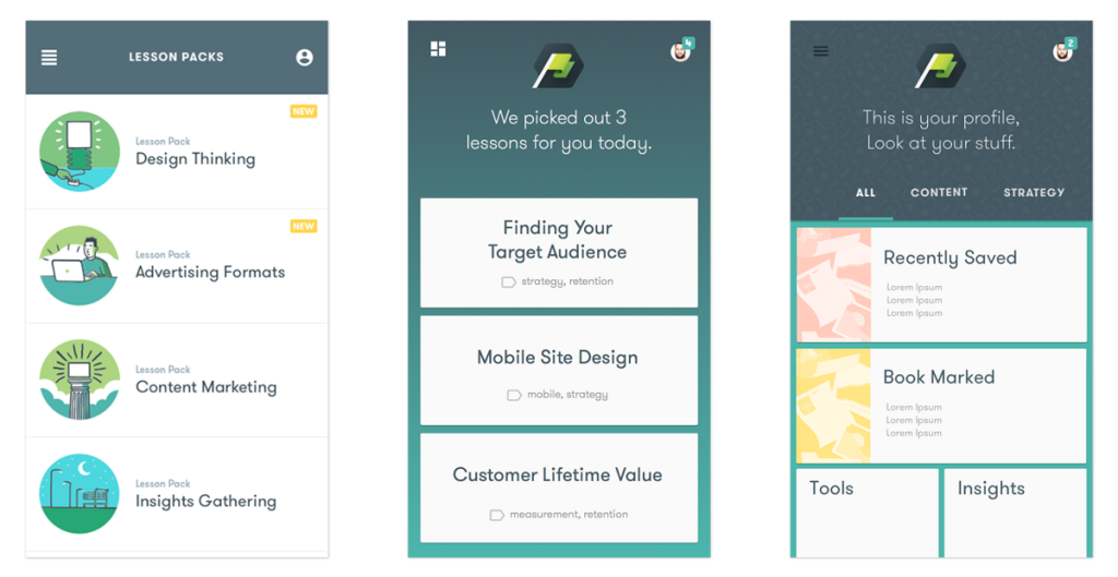
Early dashboard prototype
Obviously we need a guideline, so we start from the user’s perspective. Through investigation, it is found that users of this application can be divided into three categories:
- Passive: They will look around and browse.
- Curious: They want to learn something, but they don’t know what to learn.
- Active: They have clear goals and have more than one idea about what they want to learn.
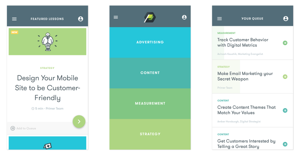
The final dashboard style: Featured, Category, and Queue.
For the passive type, we have created a special zone, which shows 5 recommended courses that people can start learning right away.
At the same time, we allow curious users to easily find courses by topics or categories, including advertising, content, metrics, and strategies.
In addition, for active users, we provide a management tool: queues. They can generate a list of exclusive courses here, and can easily add and delete courses at will.
2. Course
The next thing the app needs to consider is the course itself. The purpose of Primer’s course is to kill time to a great extent. Users can learn while on the train or when their children are watching animation.
However, learning requires concentration. We can’t let users read the course absent-mindedly.
We named our solution “Rhythmic Learning”. Each slide of each course element, each card stack, and each illustration is designed as a rhythm guide when the user reads the content.

This sliding gesture gives users a sense of completion when reading each card. Text files packed with information make people retreat, but courses broken down into cards make people feel manipulative.
These cards are stacked in groups of 3-7. Once the last card is slid away, the other group will be slid in again. Every time a set is completed, there will be a small achievement, which means that users do not need to wait until the end of the course to feel that they have learned something.
At the moment of completion, illustrations will be displayed. Each illustration is a little surprise, allowing users to integrate learning results into their lives with a smile. Although adding display illustrations to the course creation process will add additional workflow, it also adds a wonderful blend of humor and editorial (editorial-ness) to the course.
3. Activities
The third and final element of user experience design is activity. We have designed three interactive programs at different time periods: “Quick Starts” in the early stage of each class; “Mid-Lesson” in the middle of the course; and “Do it now” at the end. This Nows)”.
The purpose of Quick Starts is to let users get started quickly on the course. For example, in a search advertising course, users are asked to find striped socks in a pile of clothes. This “Waldo-style activity” shows that the value of (advertising) content at the top of search results can be clearly distinguished from other search results, rather than like socks hidden in a pile of clothes. This kind of interaction is not an exam test, but allows users to immediately think about the subject of the course.
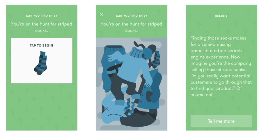
In this “quick start”, we used a “find the difference” game method to prove the advantages of search advertising.
Just like you think, “Mid-Lesson” appears in the middle of course learning, interrupting reading, and allowing users to participate in the theme interaction in a new form. In one of the lessons, our interactive form is to ask users to literally put together the puzzle of programmatic media buying. In another lesson, we redesigned the “do or not” behavior in the common sense as a complex topic. For example, in explaining “mobile user engagement”, is it a good idea to ask users to give up sending mobile push notifications? The result is obvious, and this is exactly what we want. These interactive activities bring self-confidence to users, and allow users to obtain information in an easy and intuitive way, and then form a knowledge system in their brains.
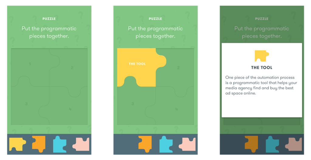
This “inter-class interactive puzzle” explains a complex concept in an easy and intuitive way.
Finally, the “Do This Nows” function provides users with a real case that can be applied to their projects immediately. Where should you track the statistics of your website? Are you ready to buy programmatically? Doing so will make the course feel more targeted and purposeful. We believe that putting the course into practice is the best way to learn, even if it is just starting out.
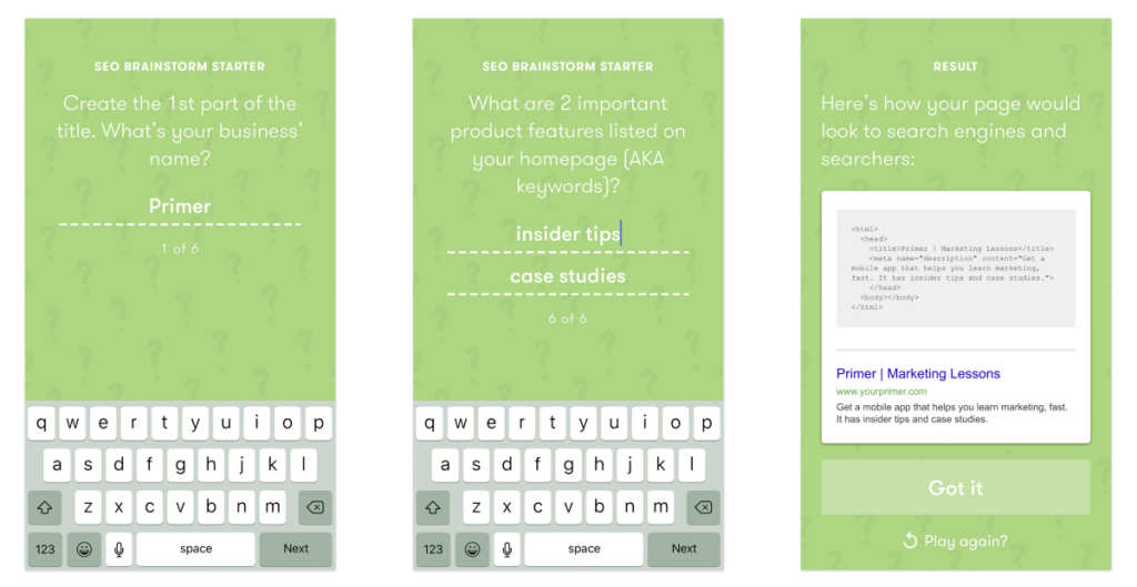
“Do it now” allows users to provide a personalized experience in the process of filling in the blanks.
Like other apps, Primer faces fierce competition in terms of living space and attention. Therefore, it is very important to provide users with an experience design that integrates knowledge, interest and high efficiency.
Our user experience design is designed to make learning more interesting. This is what many people hope. They don’t want to make learning a stressful thing. We hope users like this format and its flexibility. Learning may have been seen as an obligation in the past, but now, this is something you can easily do every morning when you are waiting for coffee, whether you are online or at home or any 5-minute free time.