Today I will share with you some of Good UI’s experience in design and operation strategies acquired in some projects. (PS.Good UI is a design agency that studies user experience.)
Today, I will share with you some of Good UI’s experience in design and operation strategies acquired in some projects. This is a dry product that I have collected for a long time. I recently started to make a website product and turned it out again. Good UI is a design agency that studies user experience. We know that successful page design not only has a high conversion rate and is more user-friendly, it can not only meet business goals but also bring a good experience to users.
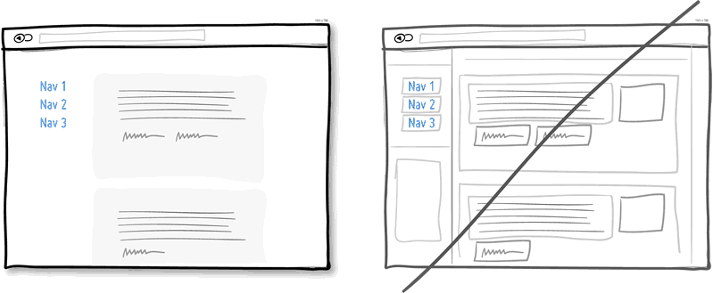
1. Replace the multi-column layout with a general column layout
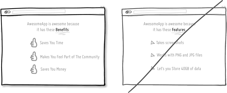
2. Give users some benefits, don’t rush to do business

3. Integrate similar functions and remove fragmented UI elements
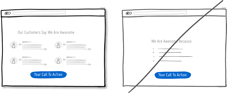
4. Take advantage of the social identity effect and don’t always brag about it
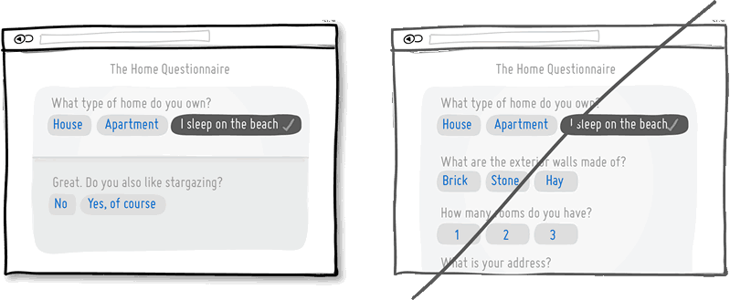
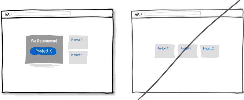
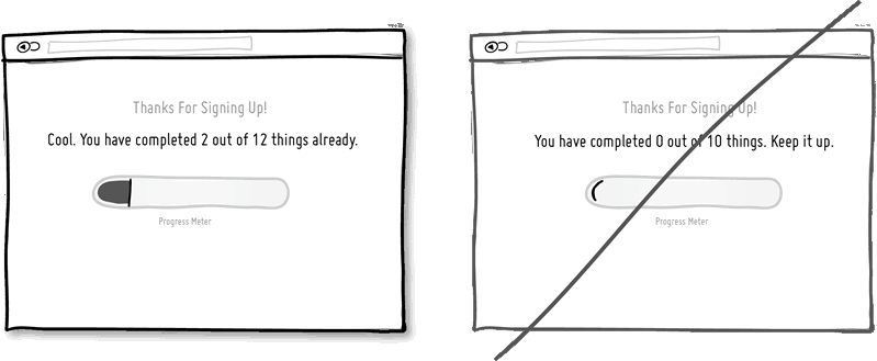
5. The main function needs to be strengthened several times
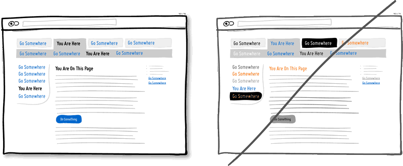
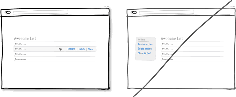
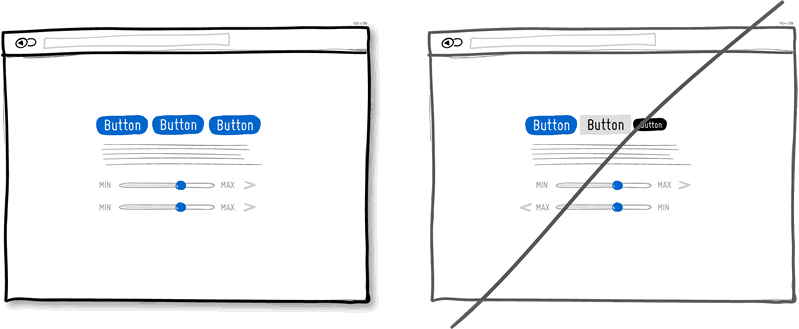
6. Distinguish between selected and clickable states, and don’t confuse users
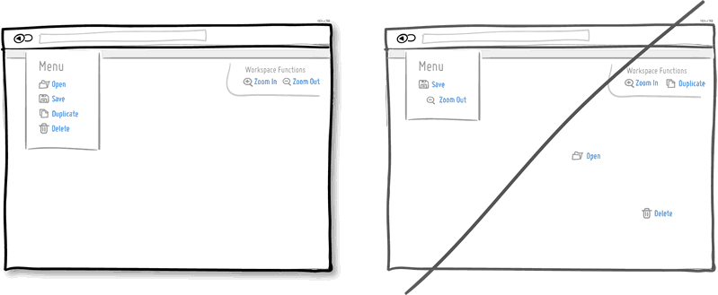
7. The layout is hierarchical and focused, rather than simply listing
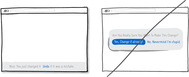
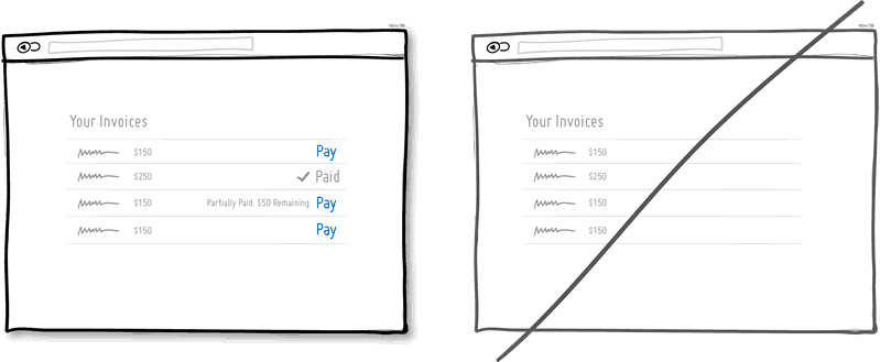
8. Allow the user to undo the operation instead of using the pop-up window to require user confirmation
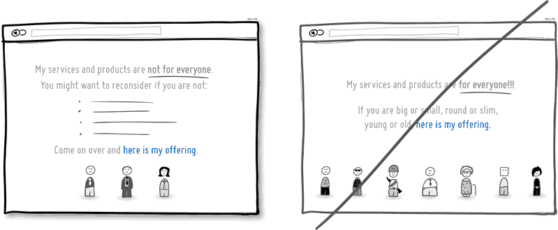
9. Clearly inform users that they are applicable to the audience rather than simply facing all users
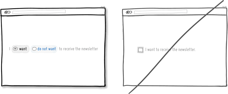
10. Concise and straightforward

11. Use more contrast methods on the page
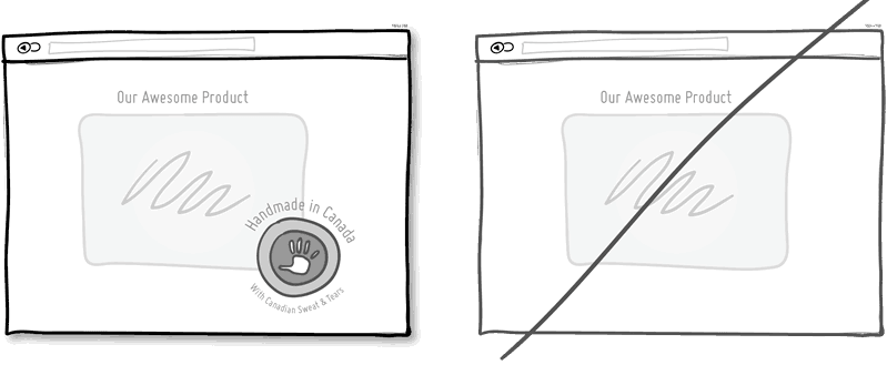
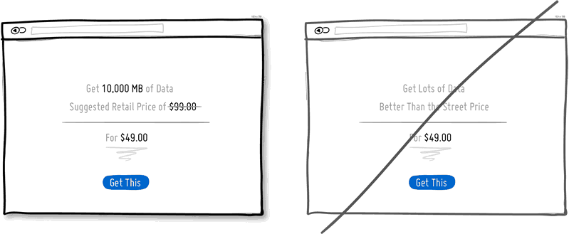
12. Mark the place of origin directly, don’t just talk about history
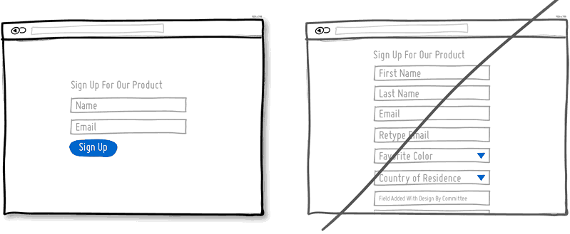
13. Use concise forms
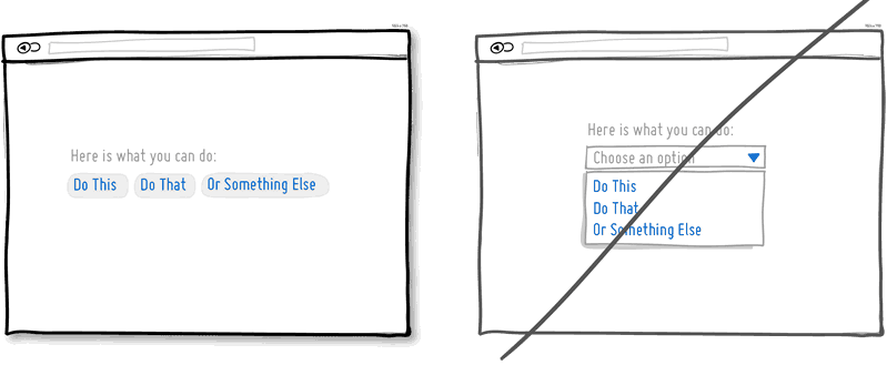
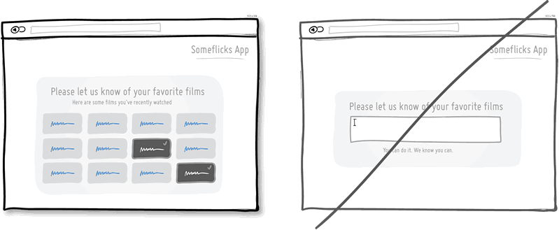
14. List options instead of hiding them
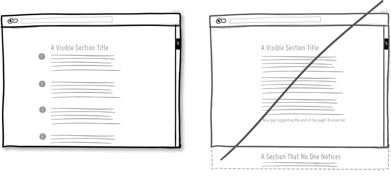
15. Use continuous prompts, don’t let users mistakenly think that the page has reached the end
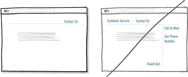
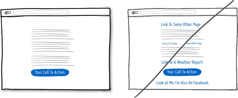
16. Focus on functions instead of using too many links
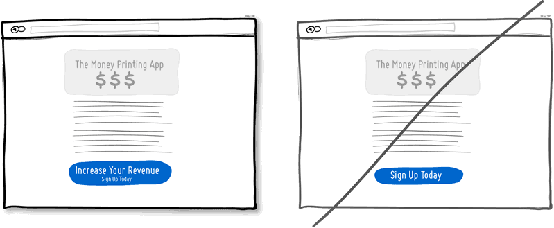
17. Prompt system status
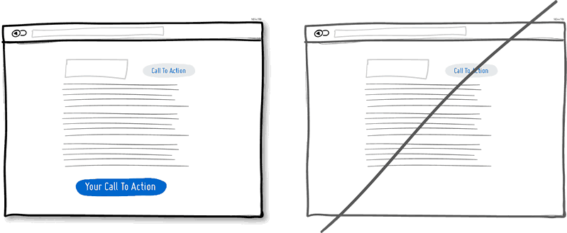
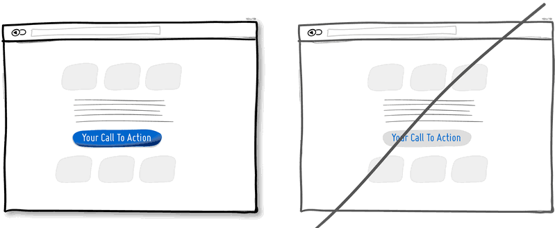
18. Add some attractive temptations to the action buttons
19. Replace countless menus with direct operations
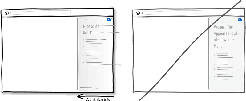
20. You can omit a page by directly displaying the input box
21. Use some dynamic effects to overdo without showing changes immediately
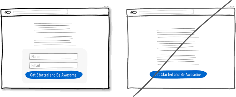
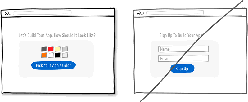
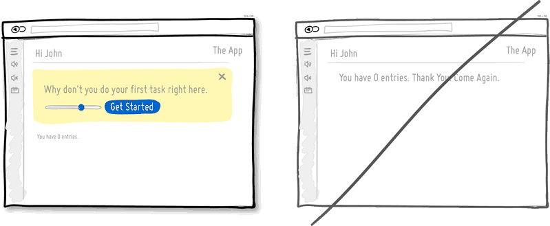
22. Guide users step by step instead of asking users to register
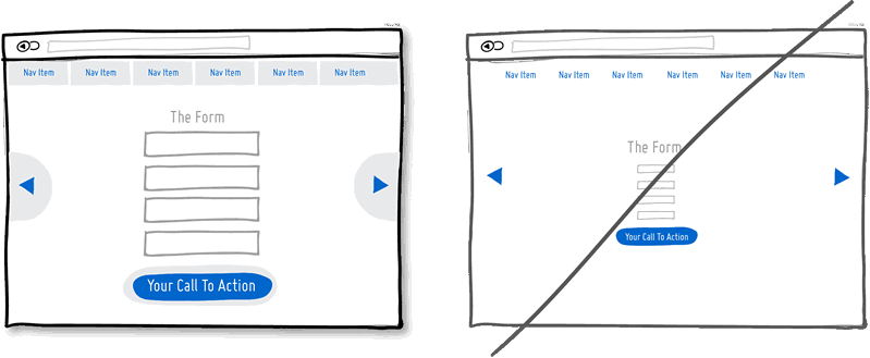
23. Try to reduce the wireframe and reduce unnecessary attention
24. Show users functional convenience instead of general features
25. Users should be good at guiding when they are not using records
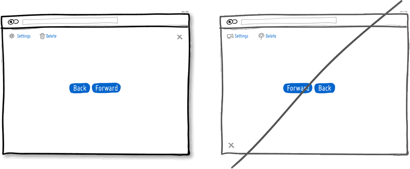
26. Give default options without user selection
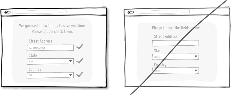
27. Maintain consistency and reduce user learning costs
28. Automatically complete some data to reduce the user’s operational burden
29. Respect users’ habits instead of creating new rules
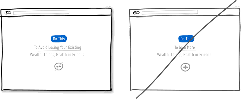
30. Remind users how to avoid risks instead of always thinking about how to make profits
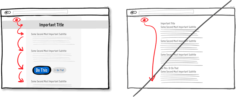
31. Good at guiding the user’s visual browsing line, not a single layout
32. Group related items into groups and don’t arrange them in a disorderly manner
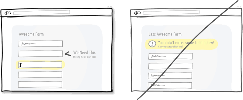
33. Use timely verification instead of prompting errors at the end
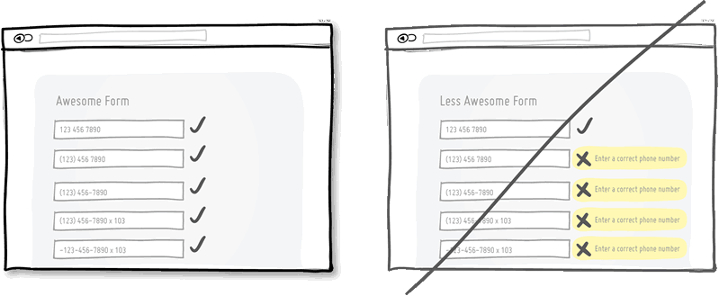
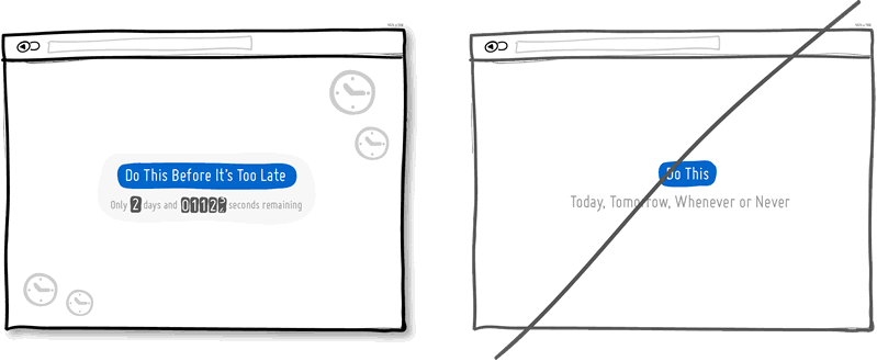
34. The format that requires user input is loose and strictly limited
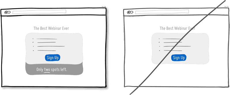
35. Let users have some sense of urgency, don’t let users delay too long
36. Appropriately try hunger marketing
37. Help users identify
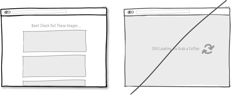
38. Use a larger click area
39. Increase the loading speed, don’t make users wait too long
40. Can provide users with some shortcuts
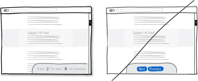
41. Use some contrast
42. Give users some incentives when initializing
43. Guide users step by step, don’t simply and rudely directly present to users